
Contrast
Contrast in art deals with using elements that conflict with one another. In color, using complementary colors gives objects a sense of contrast. In value extream lights and darks conflict with each other. With shape, large objects conflict with small objects. Shapes that have smooth organic lines will conflict with geometrical shapes with straight structured lines.
Contrast can be used to create a focal point - an area that you want to draw your audiences eye to.
Using contrast properly in your art work will make your art more interesting visually.
Contrast can be used to create a focal point - an area that you want to draw your audiences eye to.
Using contrast properly in your art work will make your art more interesting visually.
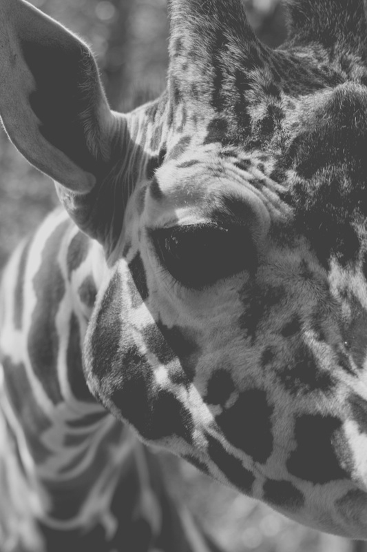
Here we have an example of a photograph that has low contrast. The values present are all close together on a value scale. Almost all the values are grey - there are no white whites ot black blacks. The image seems dull and flat when compared to the same photograph on the right.
|
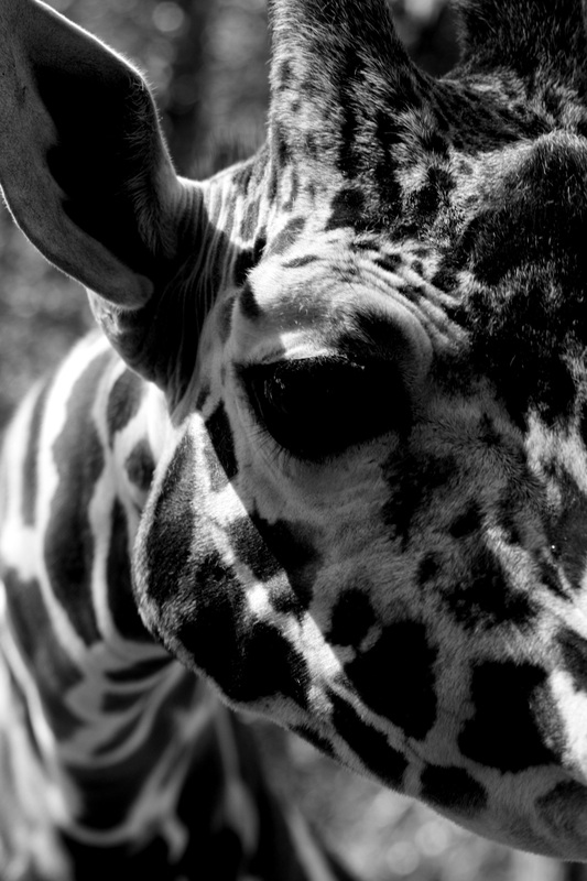
In this photograph there is a greater contrast between the values. There black blacks and white whites. By increasing the contrast in this photograph the image appears more visually interesting, vibrant and appealing.
|